Key Takeaways for Postcard Typography
- Typography determines whether your promotional postcard gets read or immediately tossed into the recycling bin.
- Selecting efficient fonts and smart layouts can significantly lower overall printing ink and production costs by up to 77% (Toner Buzz).
- Maintain a clear visual hierarchy with bold, benefit-driven headlines (18-24 pt), subheads (14-18 pt), and readable body text (10-12 pt).
- Limit font pairings to two maximum—one clean display font for headlines and one versatile font for body copy.
- Ensure high contrast between background colors and text, and keep text left-aligned for rapid scanning by local Omaha residents.
Typography determines whether your direct mail postcard gets read or ignored by your target audience. Clear, well-structured type helps readers in Omaha instantly understand your message, notice your special promotion, and take immediate action. When postcard typography is cluttered or hard to read, even the most compelling discount offer gets lost.
Did you know that using clean, efficient fonts can also reduce ink consumption and lower printing costs by up to 77% (Toner Buzz)? That isn't just visual design efficiency; it is a smart local budget strategy for small business owners across the Omaha metro area.
Why Typography Is Vital in Direct Mail Advertising
Typography acts as the silent persuader in direct mail marketing (Britannica), shaping how recipients perceive your brand authority before reading a single word. When headlines, subheads, bulleted offer points, and call-to-action buttons are clear, balanced, and visually organized, your message lands instantly.
What Makes an Effective Direct Mail Postcard?
A successful postcard gets read and acted upon. Here is what separates high-converting EDDM mailer designs from forgettable pieces:
- Clear Headline: Short, bold, and benefit-driven. Make it stand out using a larger font size, high contrast, and top placement.
- Readable Fonts: Avoid overly ornate or decorative typefaces. Stick to clean sans-serif or crisp serif fonts with generous spacing.
- Generous Whitespace: Avoid cramming every square inch with text. Whitespace improves legibility and directs eyes to key offers.
- Prominent Call to Action (CTA): Highlight your CTA with bold typography, whether it says 'Call Today,' 'Visit Our Salon,' or 'Claim 20% Off.'
Typography Tips for Maximum Reader Engagement
1. Match Fonts to Your Brand Personality
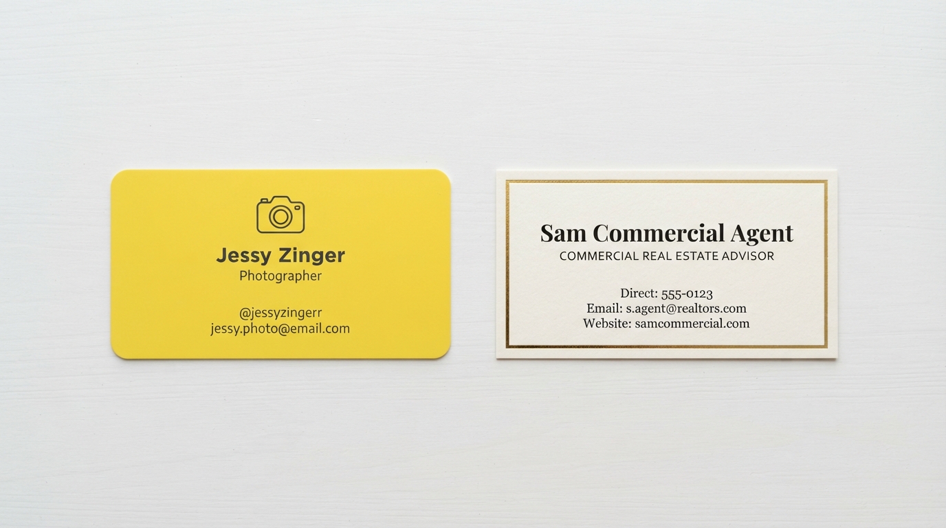
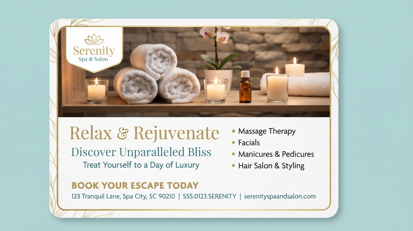
Your font choice should reflect your industry and tone. A modern Omaha tech firm might use a clean sans-serif like Helvetica or Inter, whereas a luxury spa, salon, or boutique might favor an elegant serif like Georgia or Garamond. Avoid unprofessional fonts like Comic Sans or Papyrus that distract from your offer.
2. Prioritize Readability Over Decoration
Fancy script fonts might look stylish in digital drafts, but if they are hard to scan in the mailbox, they fail. Choose fonts with open counters, clean letterforms, and high contrast against the paper background. Always test your font size at actual 4x6, 6x9, or 6.5x9 EDDM postcard dimensions.
3. Establish a Clear Sizing Hierarchy
Headlines should be the largest element (18-24 pt or larger). Subheads can range from 14 to 18 pt, while body text and contact information should stay between 10 and 12 pt so it remains legible without cluttering the layout.
4. Limit Your Font Palette
Stick to a maximum of two font families—one for headlines and main offers, and one for supporting details. Use bold weights or italic accents within the same family to create emphasis without visual chaos.
5. Align Text for Easy Scanning
Left-aligned text is the easiest for the human eye to scan quickly. Centered text works well for brief main headlines, but body paragraphs and bulleted service lists should remain left-aligned for effortless reading.
6. Keep Line Spacing and Length Balanced
Keep text lines between 6 to 8 words for rapid comprehension. Set your line height (leading) to 120%–140% of the font size (e.g., 14 pt line spacing for 12 pt body text) so lines don't feel cramped or disconnected.
7. Use High-Contrast Colors
Ensure strong color contrast between background images and text overlays (ResearchGate). Dark typography on light backgrounds or crisp white headers over dark colored blocks ensure instant readability under any lighting.
Frequently Asked Questions About Postcard Typography
What are the most readable fonts for direct mail postcards?
Clean sans-serif fonts such as Helvetica, Arial, Open Sans, and robust serif fonts like Georgia produce exceptionally crisp print results across all postcard cardstocks.
Should I use both sides of the postcard?
Yes! Use the front side for a striking visual header, photo showcase, and high-impact offer. Use the back side for service breakdowns, address details, business hours, and your primary call to action.
Print High-Impact Postcards with HuskerPrint Omaha
Looking to launch a successful EDDM or direct mail postcard campaign in Omaha? HuskerPrint offers premium 14 pt Gloss and 16 pt Premium Matte postcard printing with sharp colors and fast local service. Contact our local team today to start your next campaign!
Ready to Print With HuskerPrint?
Get a free quote and free design review on your next print project.
Request a Quote