Font choice is a crucial element when designing custom business cards for your Omaha business. Your choice of typography dictates how effortlessly clients read key details—your name, title, company name, phone number, email, and website link. Select a font that aligns with your brand identity, industry standards, and overall print composition.
Choosing a business card font isn't just about selecting font size, color, or baseline legibility. Instead, typography sets the tone for your entire physical brand presence. The right font clearly communicates your message while harmonizing seamlessly with your logo and paper stock.
What is the Best Font for a Business Card?
The best business card fonts strike a precise balance between legibility and character. Overly ornate script fonts can make critical email addresses difficult to scan, while overly generic black default text on a plain white background can fail to leave a lasting impression.
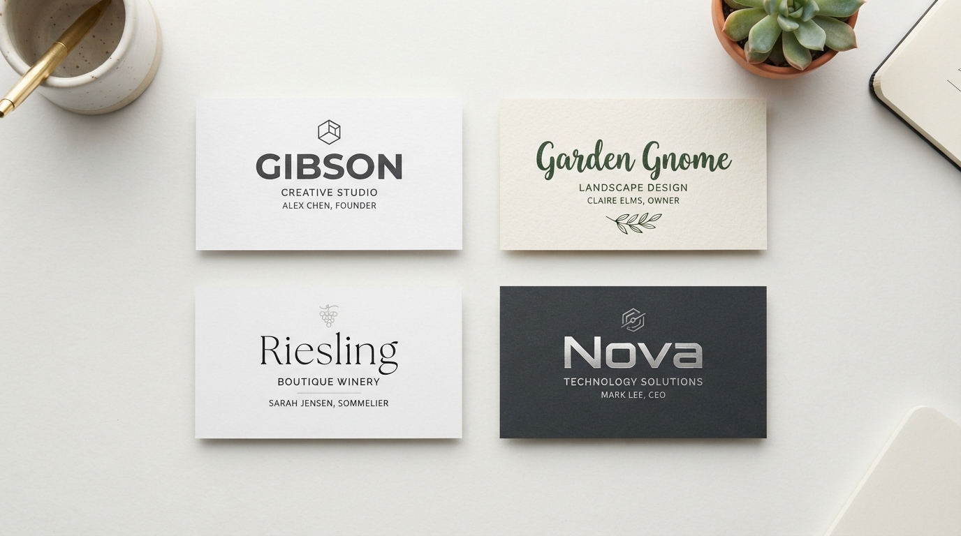
Traditional industries like law, finance, and accounting in Omaha typically lean toward classic serif or structured sans-serif fonts such as Helvetica or Trajan. Creative businesses—graphic designers, photographers, marketing agencies, and artisans—often experiment with modern geometric typefaces like Futura, Gibson, or Riesling.
How to Choose Business Card Fonts & Proper Text Sizing
When planning your layout, select fonts that pair naturally with your brand guidelines. Establishing a clear visual hierarchy with correct font sizing is essential for readable print design:
- Primary Heading (Your Name): 10 pt to 16 pt for maximum emphasis.
- Subheading (Job Title / Department): 8 pt to 10 pt for clear secondary rank.
- Body & Contact Details (Phone, Email, Web, Address): 7 pt to 9 pt for clean legibility.
- Minimum Print Size Rule: Avoid printing body text smaller than 7 pt to ensure sharp readability on textured or coated cardstocks.
How Many Fonts Should You Use on a Business Card?
Most seasoned design professionals follow the 3-Font Rule. Limiting your layout to a maximum of three fonts prevents visual clutter, maintains harmony, and guides the reader's eye naturally from your name to your contact details.
Alternatively, using a single typeface family across different font weights (light, regular, bold, or italic) creates a cohesive, ultra-clean aesthetic.
15 Simple Business Card Fonts Used by Design Pros
1. Helvetica
A timeless Swiss neo-grotesque sans-serif classic created in 1957. Renowned for its perfectly balanced letterforms, high legibility, and neutral professionalism.
2. KG Sorry Not Sorry
A clean, handcrafted all-caps font that gives business card names a friendly, approachable personality without sacrificing clarity.
3. Riesling
An elegant art-deco font featuring dramatic thick-to-thin stroke contrasts and exaggerated descenders. Ideal for boutique brands, wineries, and creative studios.
4. Gibson
Designed by renowned typographer Rod McDonald, Gibson offers an ultra-clean, contemporary sans-serif shape that commands attention on thick matte cards.
5. Ciutadella
Designed by Eduardo Manso, Ciutadella is a geometric sans-serif that embodies minimalist design without feeling cold or industrial.
6. Centrale Sans
A warm, open-character font family featuring generous spacing and friendly curves that look crisp across all business card sizes.
7. Infinity
A futuristic, rounded sans-serif featuring smooth circular geometry. Popular among tech startups, innovative agencies, and modern freelancers.
8. Garden Gnome
A playful, rounded display script font that adds joy and warmth—perfect for children's authors, tutors, bakeries, and party planners.
9. Campton
A bold geometric font drawing inspiration from early 20th-century classics like Johnston Sans and Gill Sans, refreshed for modern corporate branding.
10. Jaapokki
Features well-proportioned geometric proportions paired with unique structural accents, making it a standout choice for header titles.
11. Nexa
Extremely popular font family offering 16 weights. Exceptional legibility across small print sizes makes it an essential tool for business card design.
12. Trajan
Inspired by classic Roman square capitals inscribed on Trajan's Column. Exudes tradition, dignity, and prestige for executive and legal cards.
13. Futura®
First released in 1928 by the Bauer Type Foundry, Futura's clean geometric symmetry remains a gold standard in modern typography.
14. CODE
An all-caps display font built with straight architectural lines, giving company titles a sleek, high-tech, executive presence.
15. Nevis
Strong, angular, and authoritative, Nevis shines in all-caps header titles while maintaining a friendly human touch.
Print Custom Business Cards in Omaha with HuskerPrint
Ready to elevate your business card design in Omaha? HuskerPrint offers premium 16pt, 38pt triple-layer velvet, raised foil, and spot UV finishes with local customer service !
Ready to Print With HuskerPrint?
Get a free quote and free design review on your next print project.
Request a Quote